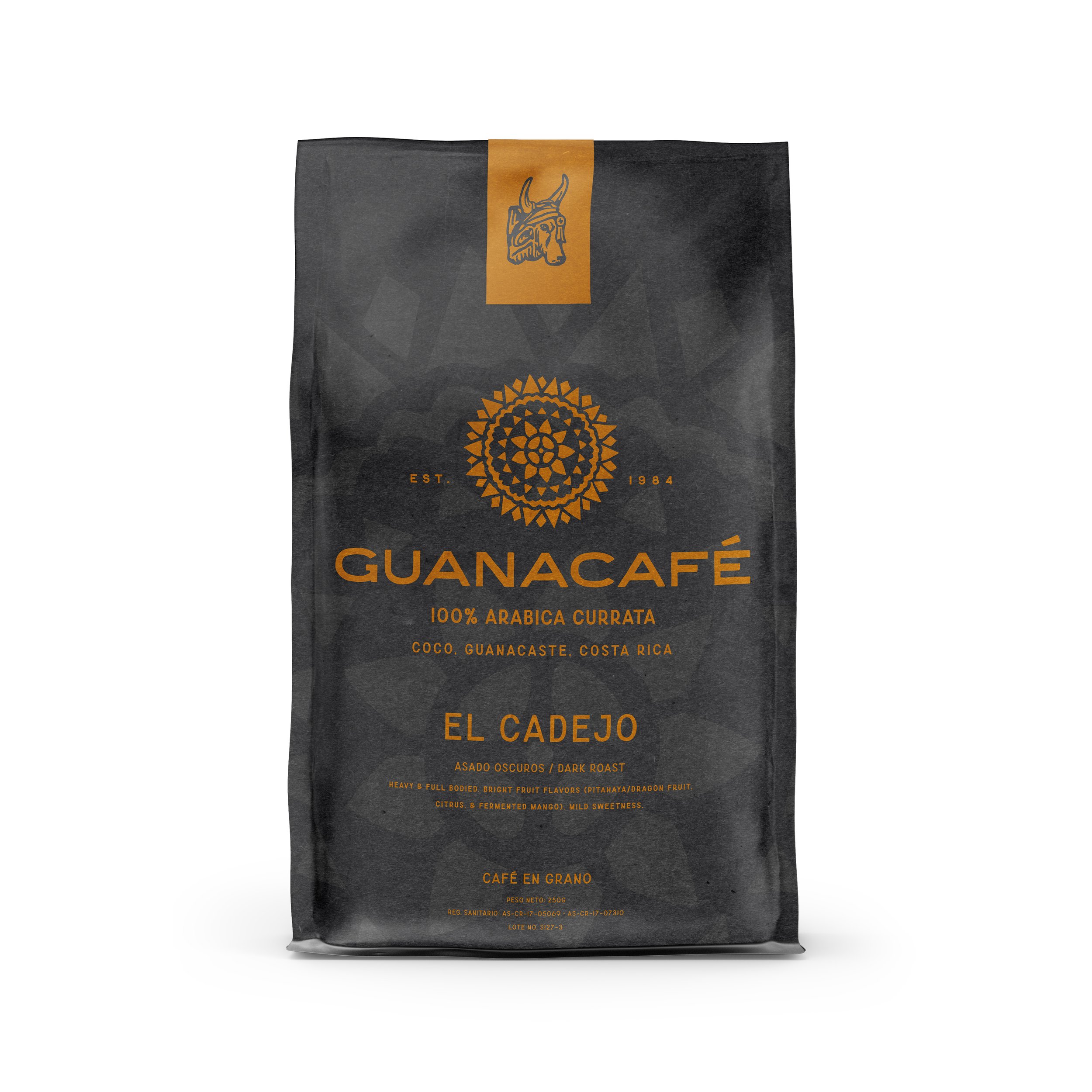
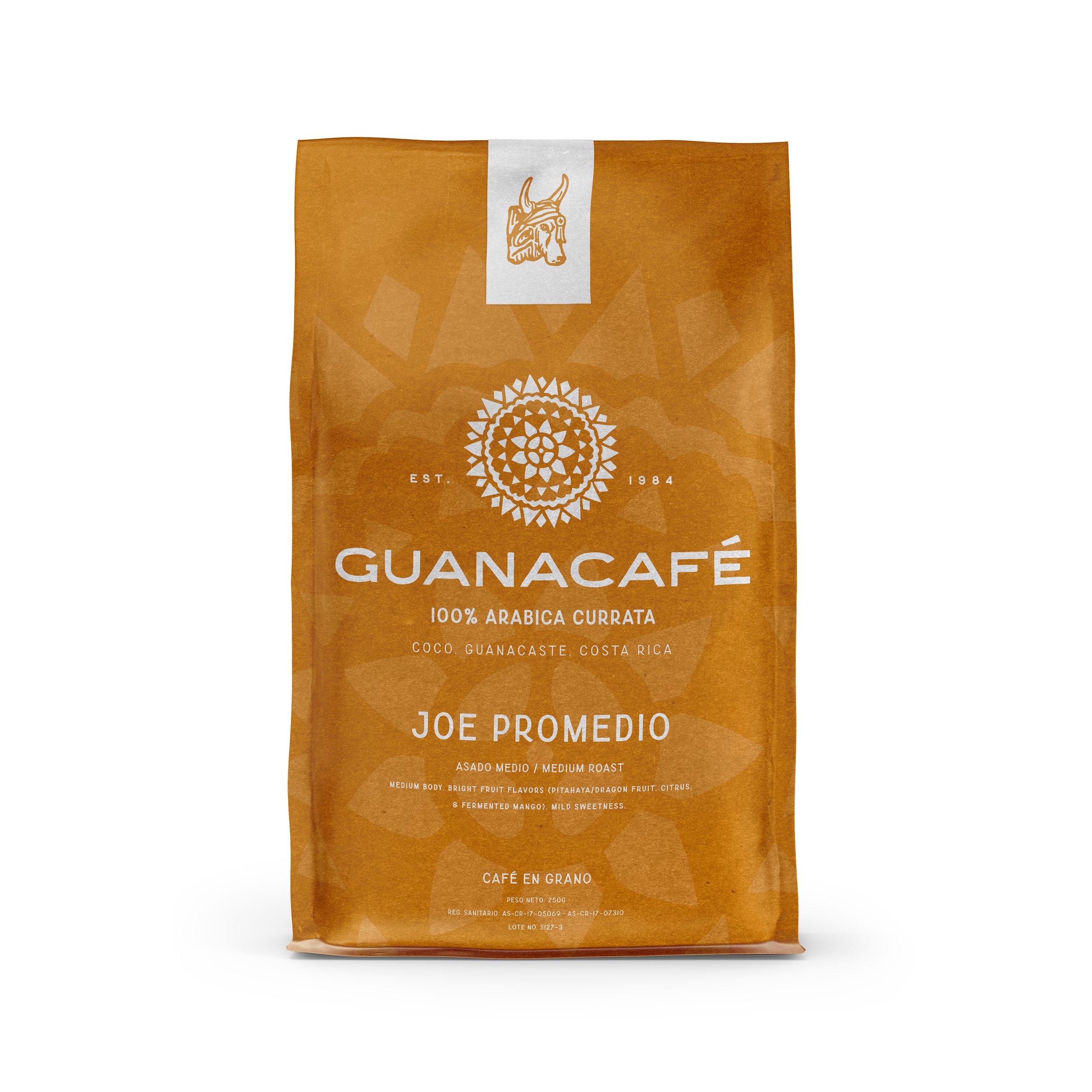
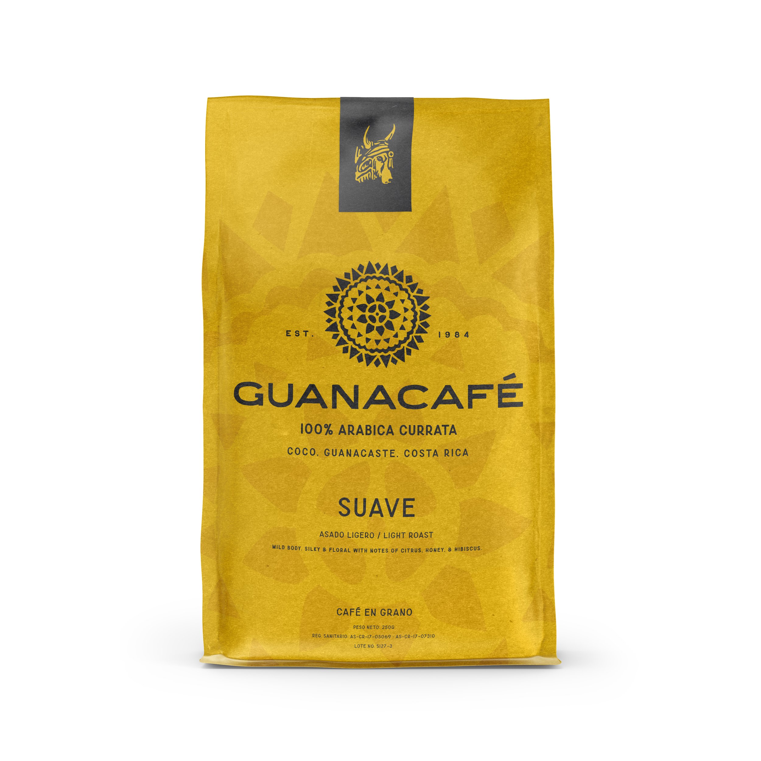
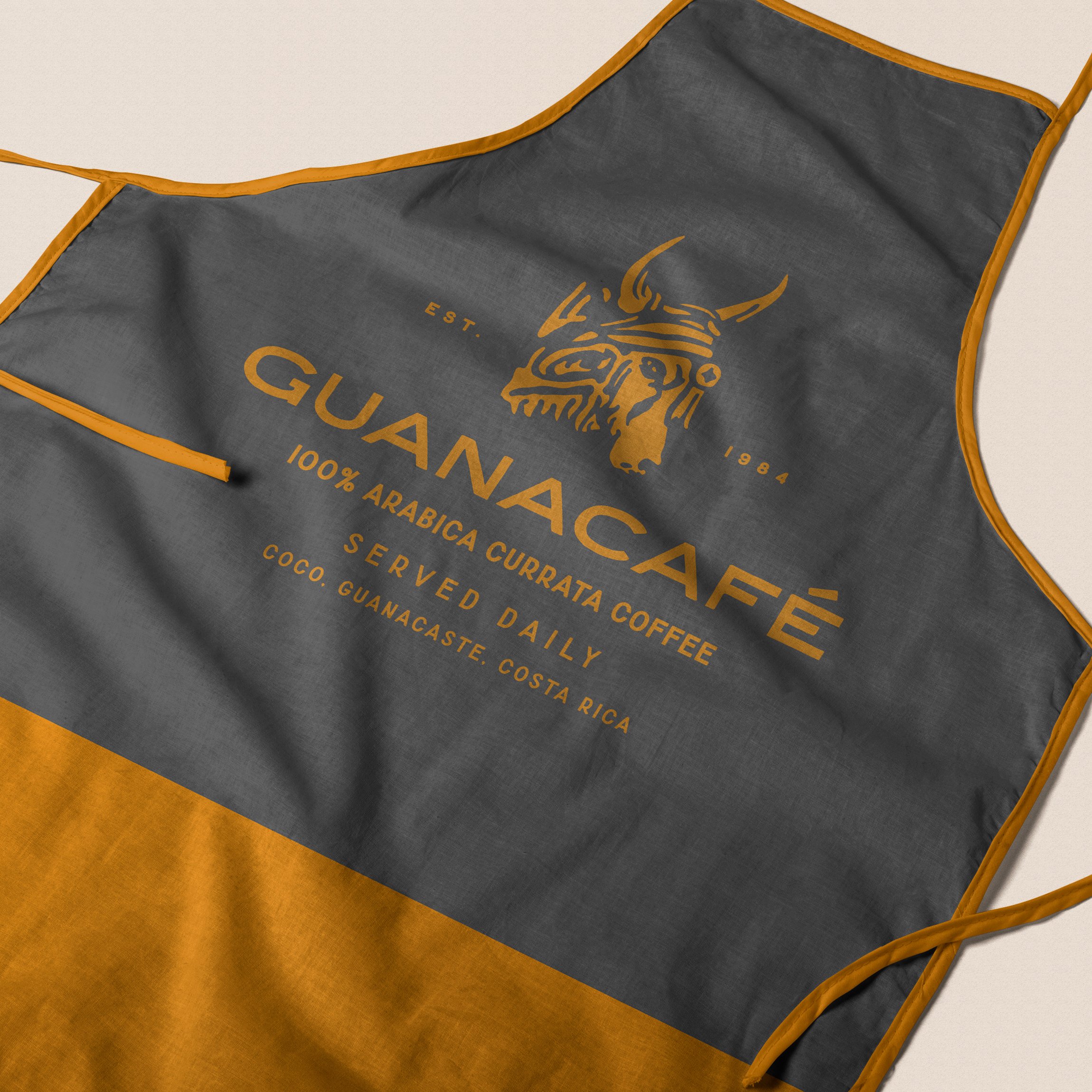
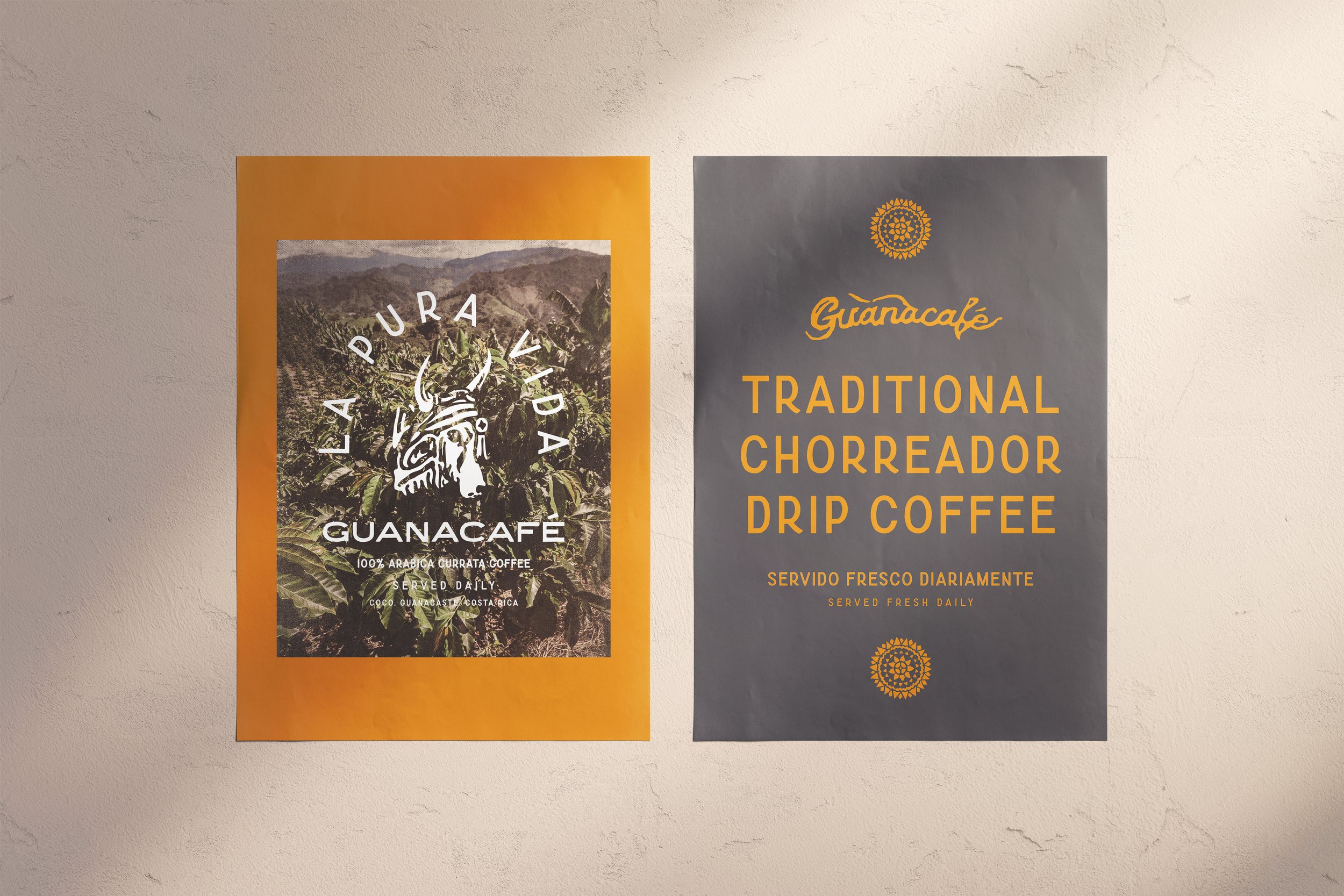
Guanacafé
Costa Rica is world-renowned for its coffee. The challenge was to balance deeply rooted familial and cultural history with branding that reflected the past, present, and future of a small but firmly established family-owned operation. A rustic vibe with warm, earthy colors, retro type styles, a diverse logo suite, and hand-illustrated graphics and icons reflecting the storied history of coffee production in the region.
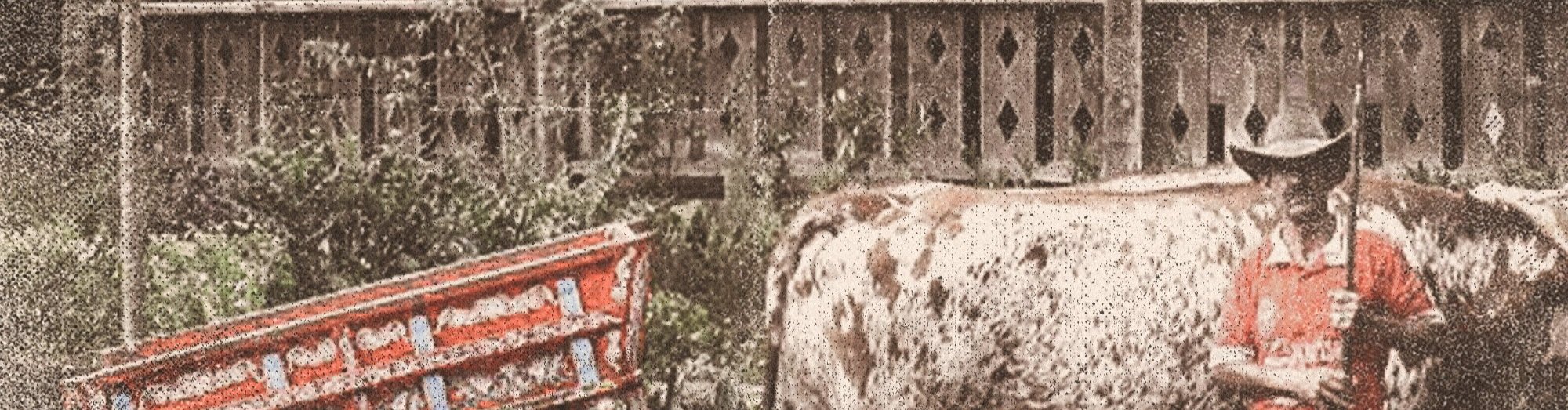
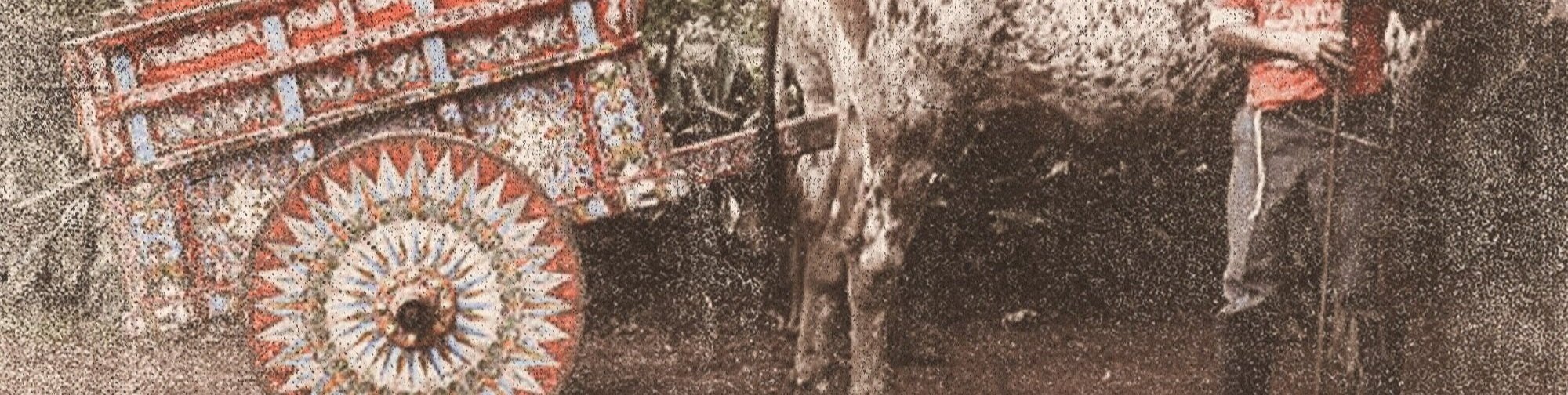
Each symbol, texture, and visual reference draws from the cultural rhythm behind the region, with the caretta wheel as the grounding centerpiece.
Historically used to transport coffee and sugar cane across rugged terrain, carretas (oxe-drawn carts) evolved out of necessity. Introduced during Spanish colonization, the early carretas featured traditional spoked wheels that struggled in uneven, often wet/muddy terrain. The wheels were eventually replaced with a solid wooden design with a reinforced metal rim, allowing farmers and merchants to move more efficiently through difficult landscapes. Over time, these wheels became known for their intricate, hand-painted patterns—often radiating outward in bold, star-like compositions.
Aside from it’s functional use, this icon carries multiple layers of meaning:
Movement — the journey from remote farms to local hubs
Labor — the physical work behind coffee production
Adaptation — design shaped by terrain and necessity
Identity — pattern as a marker of region and craft